Colour Trends And Advising Clients on POS
How to get Inspiration
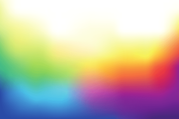
Colour is an important part of any design. Different colours evoke different emotions. For example, blue is considered calming while red is energetic. Colour says a lot to a person subconsciously and when trying to sell a customer good you want to be certain what you’re designing elicits the correct emotional response. While the general rules of colour usage in design are easy to remember current trends can be harder to predict. Trends can be easier to predict by knowing more about where they originate. This further allows you to successfully advise your clients.
Future Colour Trends
Trends in general can be traced back to a singular person, event, or company. However, it can be hard to predict what becomes a trend because so much of that is based on what people find appealing. In the basic sense, a company (or person) with a strong following can shape trends through innovation or design concepts. Industry leaders (be they companies or celebrities in a particular field) are often trend leaders as competitors in the marketplace often copy successful ideas or concepts.
Colour trends are a bit harder to predict as there is the emotional element to consider and the fact that different trends can develop simultaneously depending on the industry. In 2017 home interior design is seeing a lot of vibrant colours, earth tones, and even darker shades are of a lighter hue. So overall the trend in home design can be condensed to brighter colours but not overly loud ones. These colour schemes grow from what designers are developing in combination with market demand. As noted above industry leaders and celebrities can easily affect overall trends but other factors such as current pop culture, current events, and the overall mood of a place can have an effect on what becomes popular both with designers and the public at large.
Advising Clients About Changing Trends
When advising your clients a key factor is moderation. Using older out of style colours makes a design look out of date but it is entirely possible to overuse a design trend. Overuse of current trends comes across as pandering and fake which is the last thing you want in a design trying to persuade the public to purchase a good or service. So, therefore, make use of trendy colours but don’t overdo it.
- Redesigning An Existing Design: adding new colours to an existing pattern or logo can create a new design that is both modern and appealing. But be sure to not change things so much that the overall ‘identity’ a brand had before is lost which results in confused customers.
- Creating An Entirely New Design: when creating a new design don’t forget the basics of colour usage. Doing so helps prevent you from creating a design that uses trendy colours inappropriately or doesn’t fit the product itself.
Managing Colour Trends
Detecting a change in current trends can be a challenge. Changes in trends can often seemingly come out of nowhere if you miss the subtle signs of a growing trend. The best way to detect current colour trends is to look at new things. New malls, current fashion, new app releases on smartphones, and looking at what industry leaders are designing. If you want to pick up on colour trends walking through a newly opened mall in your area can tell you a lot.
However, be careful when looking at other stores. Always look at multiple stores and compare your findings (things such as the store layout, front windows, colour choices, etc.). This way you can be sure you’re seeing future trends and not designs by companies that lack the vision or finances to stay current. By being aware of what’s new you can advise your clients on what the current colour design trends are and how to incorporate them.
Final Thoughts And Inspiration
As with any creative endeavour when tracking colour trends inspiration helps. Here are a few sources you can use to not only track current trends in colour usage but also inspire your work.
- The Paint Industry: paint companies such as Dulux, Benjamin Moore and Behr put out yearly primers explain current colour trends their companies are innovating. These concepts can be applied to the retail sector.
- Interior Design: is an industry with a lot of variety in it aside from a wide range of colours there are different regional and international designs you can take inspiration from. Seasonal colours are another example.
- The Fashion Industry: is always moving forward in design concepts. The latest trends in fashion can inspire more than clothing.
- Nature: lastly, inspiration doesn’t have to come from a man made product. Nature has inspired design, architecture, and art for centuries.
[fl_builder_insert_layout id=2275]