How to Avoid Creating a bad POP Display Design
The concept of design is an abstract one and yet we all instinctively understand what it is. But what about good design? Are we as clear on what it is that makes a good design or a bad design? We certainly know whether a design is good or bad when we see it, but when you are rolling out a point of purchase (POP) display project you want to know if the design will work before the final unit goes in to store. But for a concept so abstract, how can you know if your design will work?
We have created a guide that draws on our experience at DisplayMode to help you understand what makes a design successful, including tips and real-life examples to help your next project be the success you envisage.
We look at examples of bad designs – one, a pencil for school children that displays a ‘Too cool to do drugs’ message, which alters in unintended ways as the pencil is sharpened. A bit of foresight and product testing could have prevented this very embarrassing mistake where children are given the message ‘do drugs’ by the time their pencil has been used and sharpened down towards the end of its length.

Another example looks at a road sign which itself is a good design, but the placement of it alongside multiple other signs renders the sign incomprehensible. Planning is needed to take place at the design stage to establish appropriate placement to ensure the sign would have the intended effect.
Steve Jobs famously said, “Design is not just what it looks like and feels like. Design is how it works”, and this is the crux it. A design may look fantastic but if it doesn’t work in the way you need it to then it is a bad design. A POP display needs to do many things – it should increase sales, raise awareness, and educate; it needs to be practical and work within the client’s retail environment; and it must be cost effective to produce. And with all that, it should still look good.
Our guide, ‘Why design is so much more than how something looks’, takes you through the things to consider and implement within your own designs to ensure that the end display unit not only looks good, but it works.
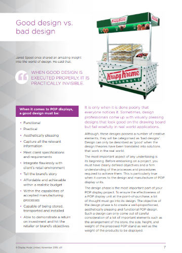
We take real-life examples of display units from Krispy Kreme, Tempur, and even our own Reflex product, and look at how they could be improved and the elements that needed to be considered and changed to meet different design briefs. The guide also includes details of a POP display for Tic Tac that achieved an increase of 87% in sales after installation, and what the key was to this hugely successful design.

It was automotive executive, Ralf Speth, who once said, “If you think good design is expensive, you should look at the cost of bad design.” Design mistakes will require expensive alterations and modifications resulting in major delays and wastage of financial resources, and can also, as in our pencil example, even bring reputational embarrassment. Our guide will help you understand the elements of good design and provide you with the knowledge and tools to ensure your next design project is a success in every way.
Download our free guide ‘Why design is so much more than how something looks’ to find out more
[fl_builder_insert_layout id=2552]
Steve Jobs Image attribution:
https://en.wikipedia.org/wiki/File:SteveJobsMacbookAir.JPG
Licensed under creative commons